Imagery
Imagery can provide lightness and clarity in an often complicated industry. Utilize them to add texture, color and lightheartedness where appropriate.


Illustration
Since what we do isn't a physical thing we can take photos of, illustration is one of our best methods for visualization. Our approach to illustration is bright and linear. Illustrations are geometric in nature and created with scale, color, texture and composition in mind.
We often use illustration to recreate graphs to display data in a more interesting way. Illustration can be used for infographics, data, handwritten lists and icons.

Iconography
STANDARD ICONS
Yes, our icon style. It's beautiful, isn't it? Icons can be such a simple and effective way to illustrate ideas, create categorization, and bridge the understanding gap.
These are custom-to-Canopy icons to be used only on Canopy branded collateral and presentations.

UI ICONS
These icons are used in our product and are smaller and simpler than our standard set.

Product Images
IN OTHER WORDS: SEE WHAT WE SELL.
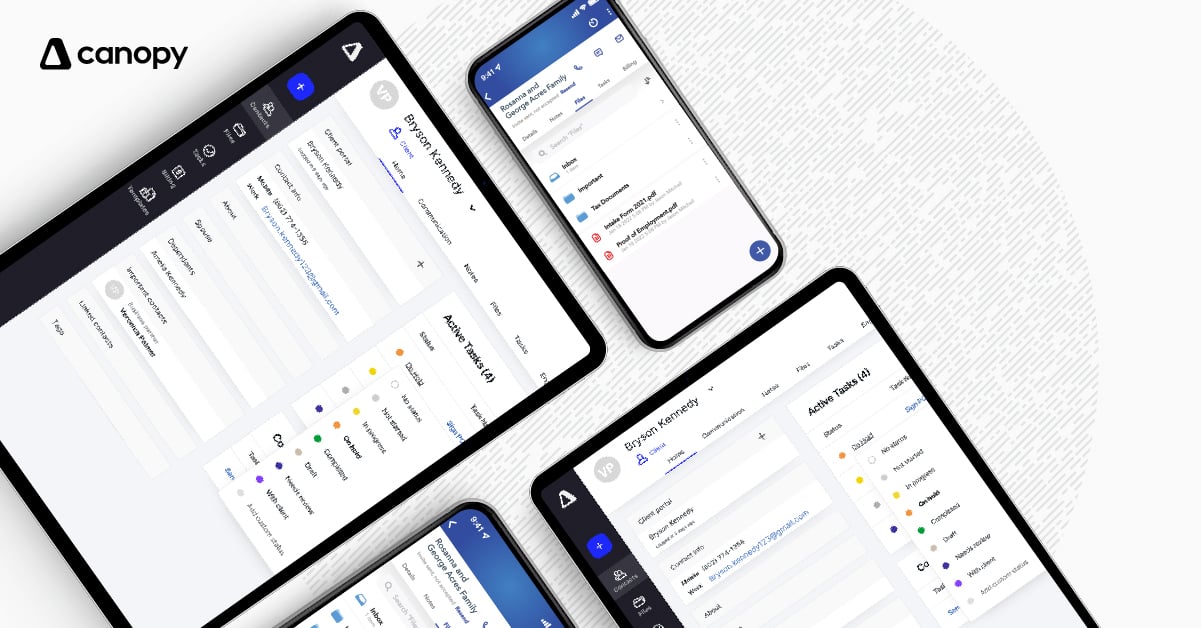
We love to show off what we do. Screenshots of software can get boring and confusing so we do our best to 1) have amazing looking modules to begin with and then 2) serve the visuals and ideas to you in ways that actually make sense. Our whole goal is that our customers can easily understand what exactly they are getting themselves into.

Collage
Yet another "illustration" method that we employ to create variety and unique points of view in our imagery.
