What's New:
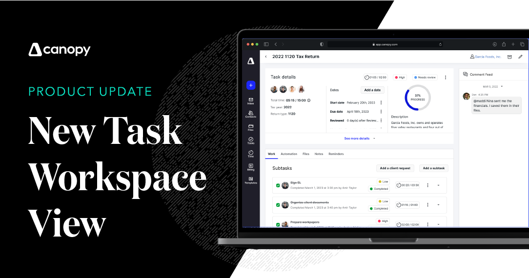
We’ve recently modernized the task workspace that will make it easier to visually understand the work within your firm on the task or subtask level. We hope this new redesign will create a better user experience by putting more focus on the work itself and streamlining the information you see when you select a task.
Specifically, we’ve eliminated redundant elements, provided a visual progress graph, and generally organized related information to make it easier for you to:
-
Collaborate using the internal comment feed
-
Navigate to pertinent information
-
Access related files
-
And more
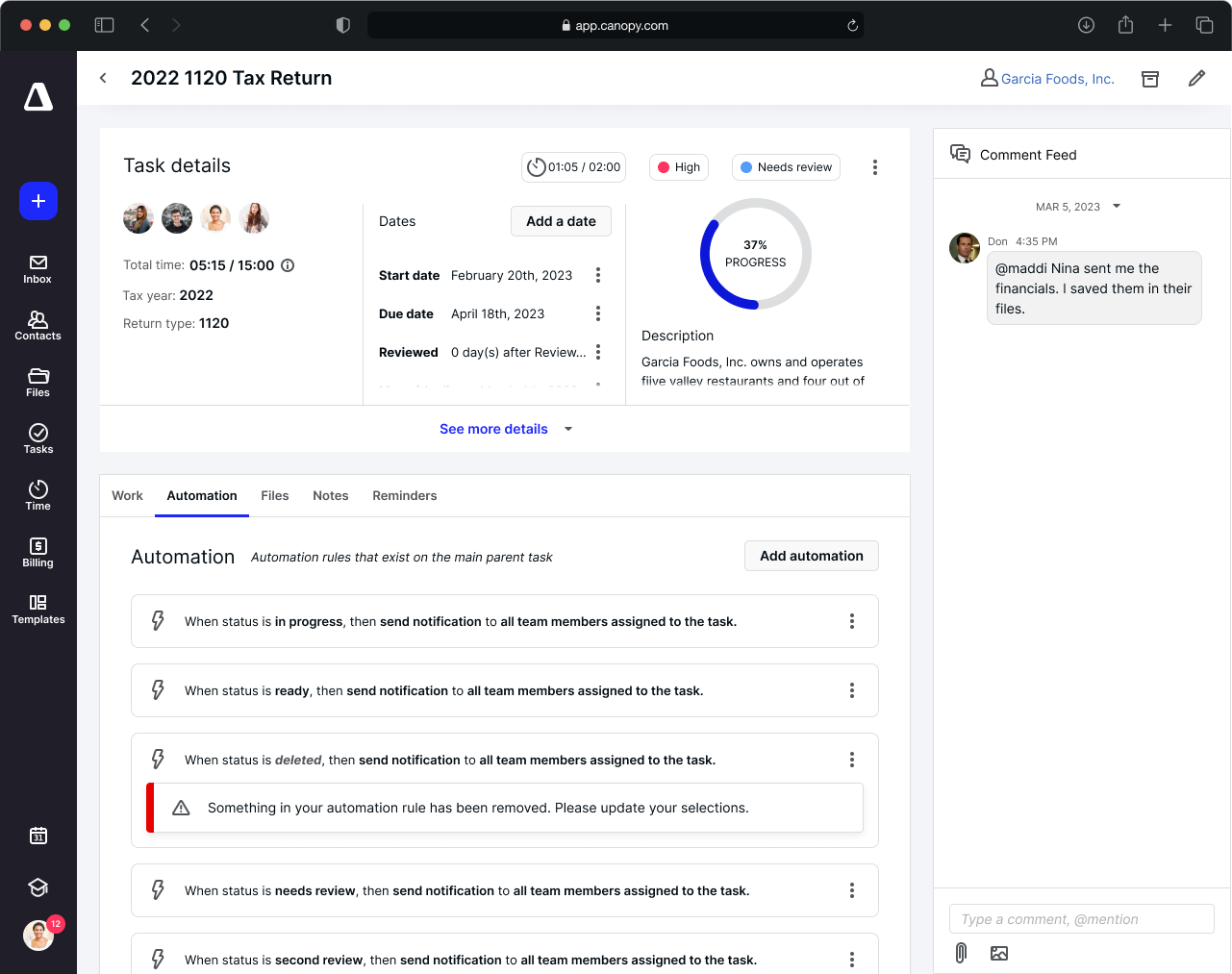
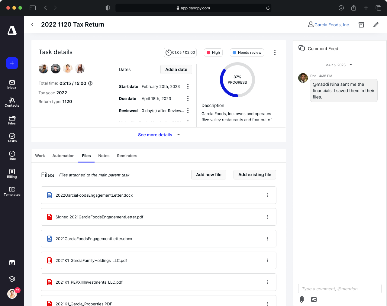
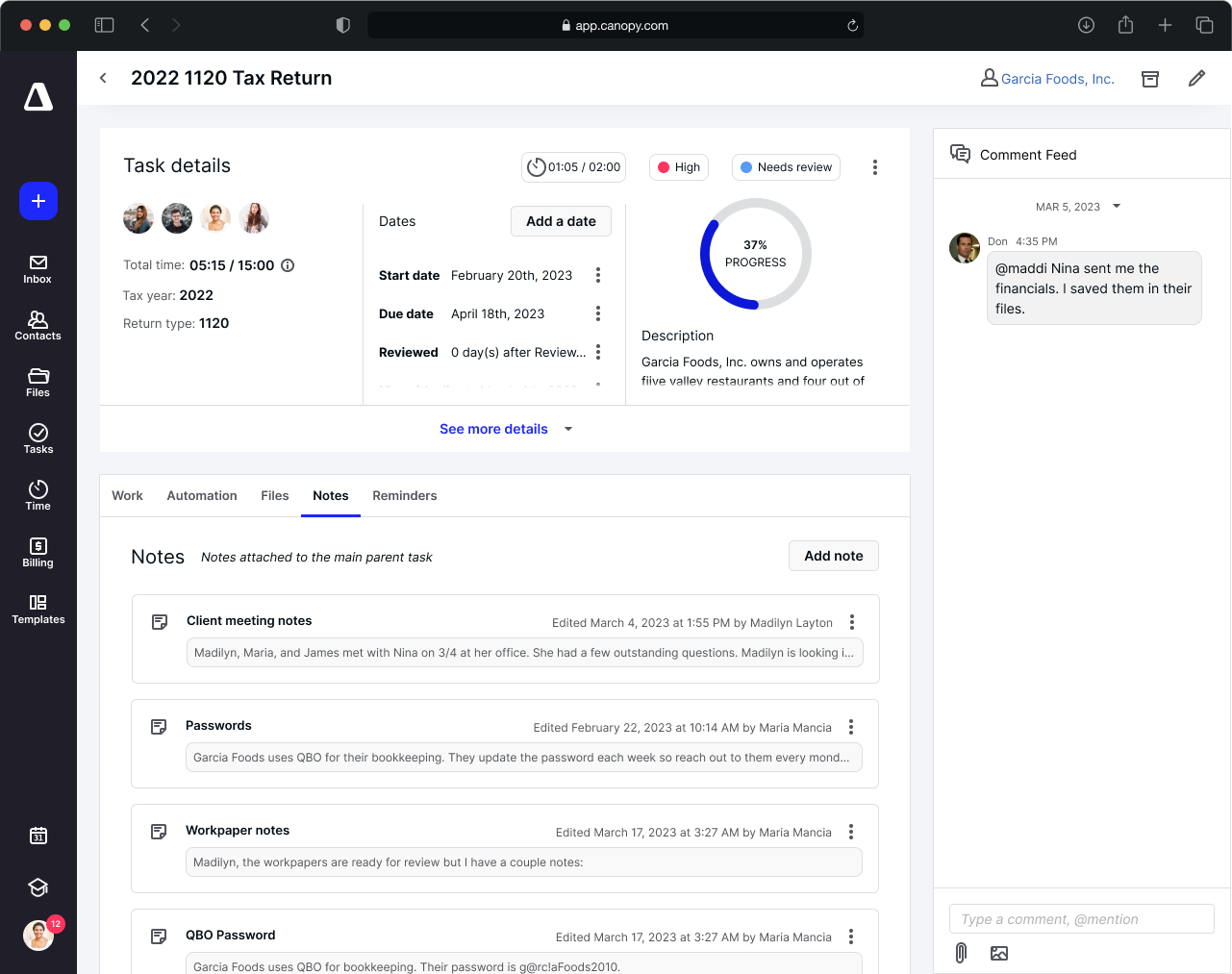
Additionally, this update will make it easier for us to add more functionality in the future without overwhelming the individual managing a specific task.
Users will be able to opt-in (and out) of this new experience during the 2023 tax season. However, at a future date (after tax season) this new feature will become permanent. To opt-in, simply navigate to the Task List and click the present icon at the bottom right corner of the page.
Why it matters:
Managing work can be overwhelming at times–working on multiple tasks or subtasks for multiple clients, trying to meet deadlines, and switching back and forth depending on when clients can get you what you need, all while trying to provide better customer experiences. This redesign will hopefully make it easier for you to quickly view, update, access, and collaborate on each task in ways that will save your staff headaches and your firm time.
Where to find it:
Available in Canopy in the Workflow module.
Get started:
Check out these articles to learn step-by-step instructions and further explanation of this new feature release.



Get Our Latest Updates and News by Subscribing.
Join our email list for offers, and industry leading articles and content.